Instacart is a real online grocer that has made some of its data available for download and use. The customer dataset used as part of the analysis was synthesised and contains data on number of dependencies, income and more.
Several important business questions were answered to allow the hypothetical marketing department to better target its customer segments, as well as gleam insights into some of the operational aspects of the business. What follows is a presentation of the steps taken to uncover these findings, how this was done and the recommendations based thereon.
In search of answers to questions like:
- What are busiest days of the week?
- What are the busiest hours of the day?
- Are there particular hours of the day where spending is the most?
- What are the price range groupings like?
- Are there certain types pf products are more popular than others?
- Are there differences in ordering habits based on customer loyalty?
- Are there differences in ordering habits based on a customer’s region?
- Is there a connection between age and family status in terms of ordering habits?
To answer these questions and gleam further insights into the sales patterns of Instacart, I used Python and a host of powerful libraries
Tools:
- Python
- Jupyter Notebooks
- Libraries : Pandas, NumPy, Seaborn, Matplotlib,
Data:
- open source data
- >3 Million Rows
- 23 numeric & categorical variables
- Joins: Order, product, customer & Department
Let's Begin!
Step 1: Initial Exploration & Cleaning
The first steps in this analysis involved inspecting the orders (transactions) and products data frames, to get an understanding of the shape of the imported data frames and the basic statistical descriptives.
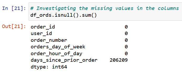
Next were consistency checks. Here I wrote code to search for missing values and mixed value types in the columns. I investigated missing values by creating subsets for the missing values. Some rows were deleted. Where there were missing values for the “days since prior order column I established that these were new customers. I dealt with this in the next stage.
Step 2: Data Wrangling
In this step I first identified columns which were unnecessary for the analysis and dropped them from the dataframe. I also renamed some columns for easier understanding and changed the 'order_id' column from integer to string type.
At this point I was dealing with a customer table, which held sensitive personal data of customers. I deleted first and last names, and also addresses. For the purpose of this analysis only the the state in which the customer lived was interesting. I could now proceed to merging/ joining.
Step 3: Merging Data Sets
Before merging the datasets to one composite table, I confirmed the shapes of the data sets. This means looking at the number of rows and columns in each, so that I can choose the appropriate type of join.
I joined the data sets using the “product_id” column since they had this in common. This could be termed a left join since the orders data frame was the ‘longest’ and could slot-in the other data frames.
 It's important to use a variable that two tables have in common
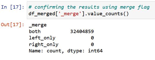
I confirmed the success of the join with a ‘True-False’ indicator. The join was successful and there were no false flags. Now it was time to begin deriving new columns/variables.
Step 4: Deriving new columns/variables
In order to answer questions and gleam new insights into the sales patterns of Instacart, I derived new columns which created labels based on certain parameters.
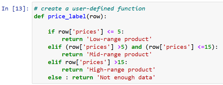 If statements are just one of the ways I could have done this
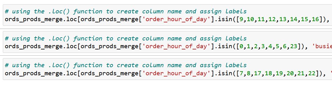
I generated a frequency count for number of order for each hour of day. Then created labels for ‘fewest-’, ‘average-’ and ‘most orders’ in the newly created ‘busiest hours of day’ column.
Now we can look at further groupings…
Step 5: Grouping Data
I used grouping() and transform() functions to create a column which states the maximum number of orders per unique customer id. This ‘max’ value will then show up wherever the user_id comes up.

Thereafter I used the loc() function again to create a loyalty flag column wherein each user_id was marked as either a ‘new’, ‘regular’ or ‘loyal’ customer based on the number of maximum orders for that customer (user_id).
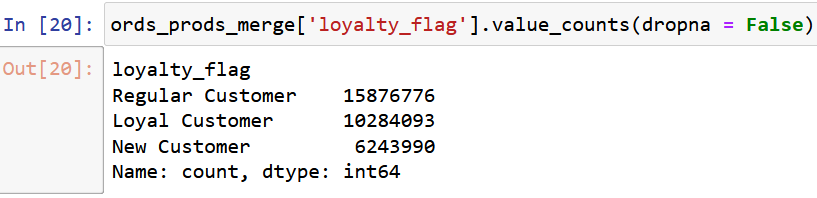 This is the result of creating the loyalty flag
Using a similar process I classified customers as ‘low-’ or ‘high spender’, using the average spend for the customer segments. Then I used transform(‘median’) to classify customers by frequency of orders from the ‘order frequency’ column.
Step 6: Visual Analysis
Once the grouping were done I used visual analysis to represent the frequencies I had generated for the different groupings and flags. Visual analysis helps in making patterns or trends easily recogniseable. What follow are some of these visualisations.
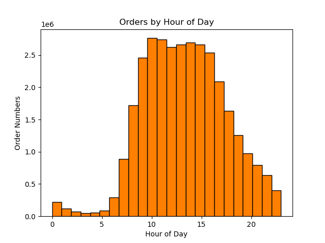 The above chart shows the number of orders for each hour of the day.It shows that the most orders are made 10am and the least are made at 3am
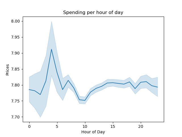 The average price serves as a measure of spending by customers, which is not entirely correlated to order numbers because of differing prices for producst. As the chart shows, customers spend the most between 3 and 4am.
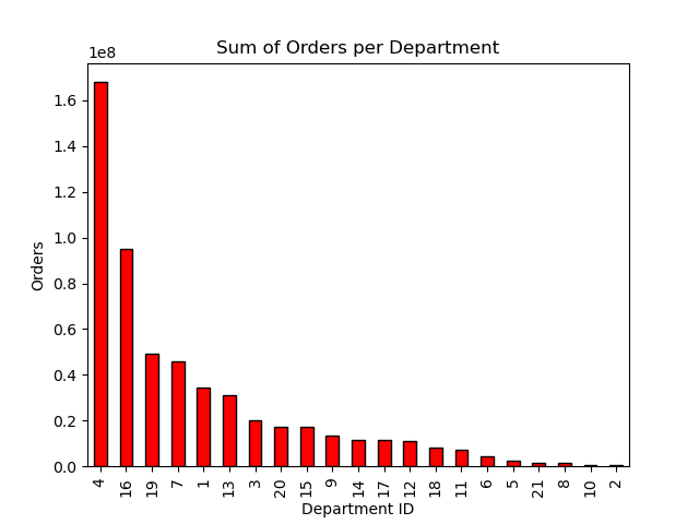 The above chart shows the number of orders per department. Produce, dairy and eggs and snacks are the departments with the highest number of orders.
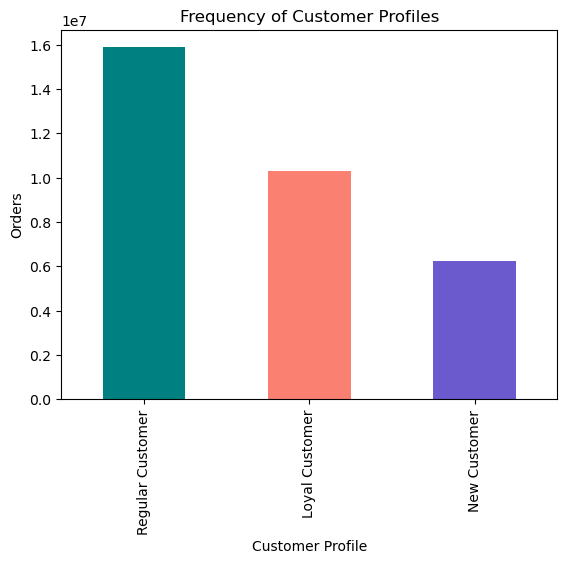 We can see that the majority of orders come from regular customers, and not from what is defined as loyal customers. Loyal customers are defined as having more than 40 orders. Regular as having between 10 and 40 orders, and New customers have fewer than 10.
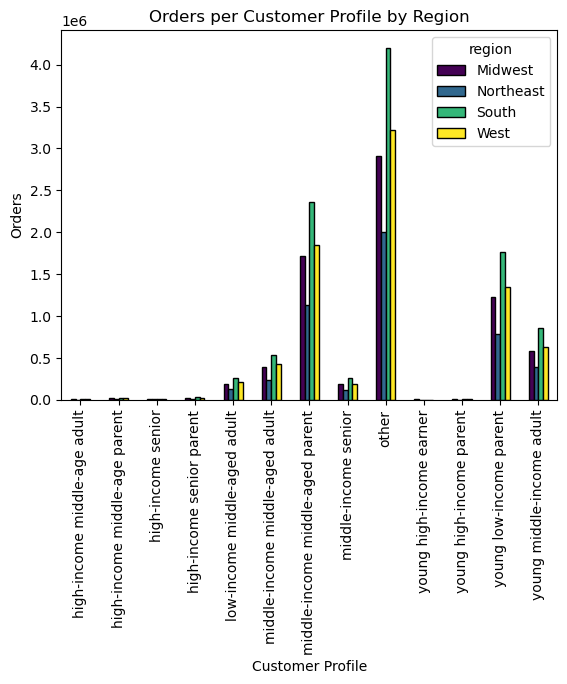 The bar chart shows the distribution of different customer profiles in the different regions of the US.
What can be seen for all the different customer profiles, is that the South (in green) also generates the most orders. Middle-income, middled aged parents are the customer group that spend more than any other defined customer group (excluding 'other'). Young, low-income parents are the second largest group. It seems that parents generate more orders.
Recommendations
In conclusion I can offer reccomendations based on the questions first posed at the beginning of the analysis:
- The most orders are placed on a in descending order: Saturday, Sunday, Friday, Monday, Thursday, Tuesday, Wednesday.
- The most orders are made 10am and the least are made at 3am.
- As the chart shows, customers spend the most between 3 and 4am.
- WThe price range can be described as continuous. The prices should be closer to flat rates (e.g. 3.99 or 4)
- Produce, dairy and eggs and snacks are the departments with the highest number of orders.
- We can see that most orders come from regular customers and not from what is defined as loyal customers.
- The Southern region of US states (e.g. Florida, Georgia etc.) generate the most orders.
- Middle-income, middled aged parents are the customer profile that spend the most, then young, low-income parents. Parents seem to order the most.
Reflections
This analysis project was especially interesting because it highlighted the power and use of Python for processing large data sets. One challenge was writing code which my machine could implement efficiently. Also, limiting the number of visualisations was of key importance. Overall it was a wonderful project.
Download Project FolderPlaceholder text by Mnguni Zulu. Photographs by Mnguni Zulu.