Introduction & Objectives
Every year there is an influenza season, identified with a spike in the number of influenza infections and resulting hospitalisations.
I was asked to analyse historical data, to forecast staffing needs for a medical staffing agency, which provides temporary workers to clinics and hospitals on an as-needed basis across the USA.
It began with drawing business requirements from stakeholder meetings, pointing to areas of concern and ideas for the analysis itself.
Tools:
- Excel (Pivot, VLOOKUP, Integration)
- Tableau Public for visualizations
Data:
- Open source data
- 4 Possible Data sets
Step 1: Data Selection
After drawing of requirements from the stakeholders, it was time to evaluate each data set. I conidered the source of data, its reliability, ownership and ethical concerns (since I am using some medical data, this is important).
Because my focus was on sending the staff to those states which will experience the greatest need I focused not on reported influenza cases but on actual deaths related to influenza.
From 4 possible datasets I chose to use:
- US Census Data by Geography
- US Influenza Deaths
Step 2: Cleaning & Consistency Checks
I inspected the data in Excel. I discovered that there naming inconcistencies which I corrected and also regions (like in Puerto Rico) which are not within the US, which I eliminated from the data set.
Where there were missing values or names, I inserted averages, modal values. Now that the dat was cleaned and workeable could proceed with the next step.
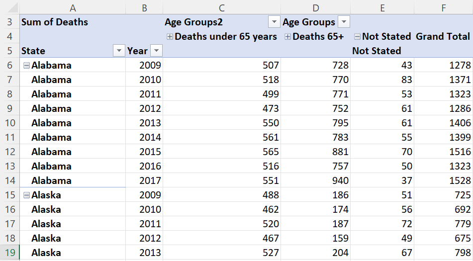
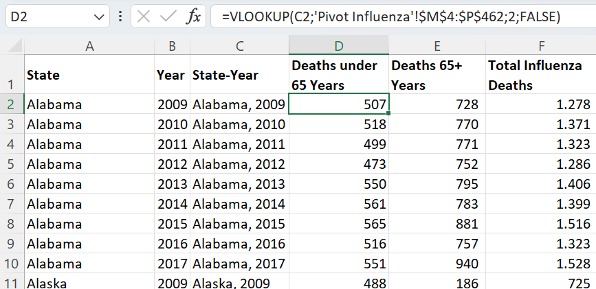
Step 3: Integration
To be able to use a data set for analysis one must often integrate/ merge data using some common key or variable. This is because we seldom find a complete data set which is ready for use as is. This is what this step was about.
I began by mapping the data, trying to find commonalities between the two data sets. I identified 'state' and year as common columns. But the US Census data had records for each county in each state, whereas the Influenza Deaths data was only for each state. This was a 'granularity' issue.
Step 4: Statistical Analysis & Testing
H0: µInfluenza mortality 65+ years = µInfluenza mortality <65 years
HA: µInfluenza mortality 65+ years <> µInfluenza mortality <65 years
The null and alternative hypothesis are stated above. I was trying to test whether the two groups had the same risk of death/hospitalisation from influenza. This was a two-tailed test, because I was interested in knowing whether the average mortality rate is higher or lower for those in the age group 65+.
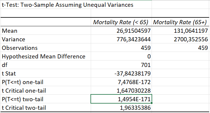
The test produced a result with a p-value= 1,50E-171 (rounded). The p-value is much lower than the alpha. This means the groups are significantly different.
The null hypothesis was rejected. At a 95% confidence level I found significant differences between the average Influenza mortality rates for those aged <65 years and those 65+ years of age. Because of this strong result, I continued my analysis to identify where the age group of people 65 and above are a higher proportion of total poulation.
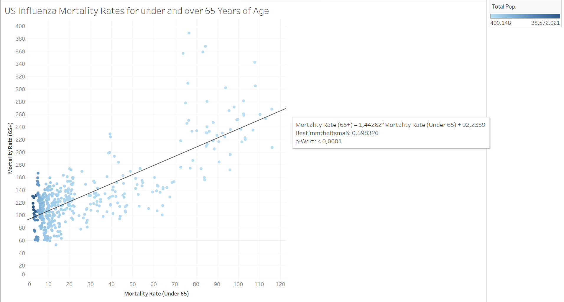 Even the mortality rates have little positive correlation
Step 5: Visual Analysis
The objective of the project was to create recommendations for the allocation of temporary staff. This means placing them at the right time and with focus on priority areas. I grouped the 50 US states into their geographic areas and performed a temporal analysis with the aid of Tableau. The results were clear. The number of influenza deaths increases rapidly in December and spikes in January.
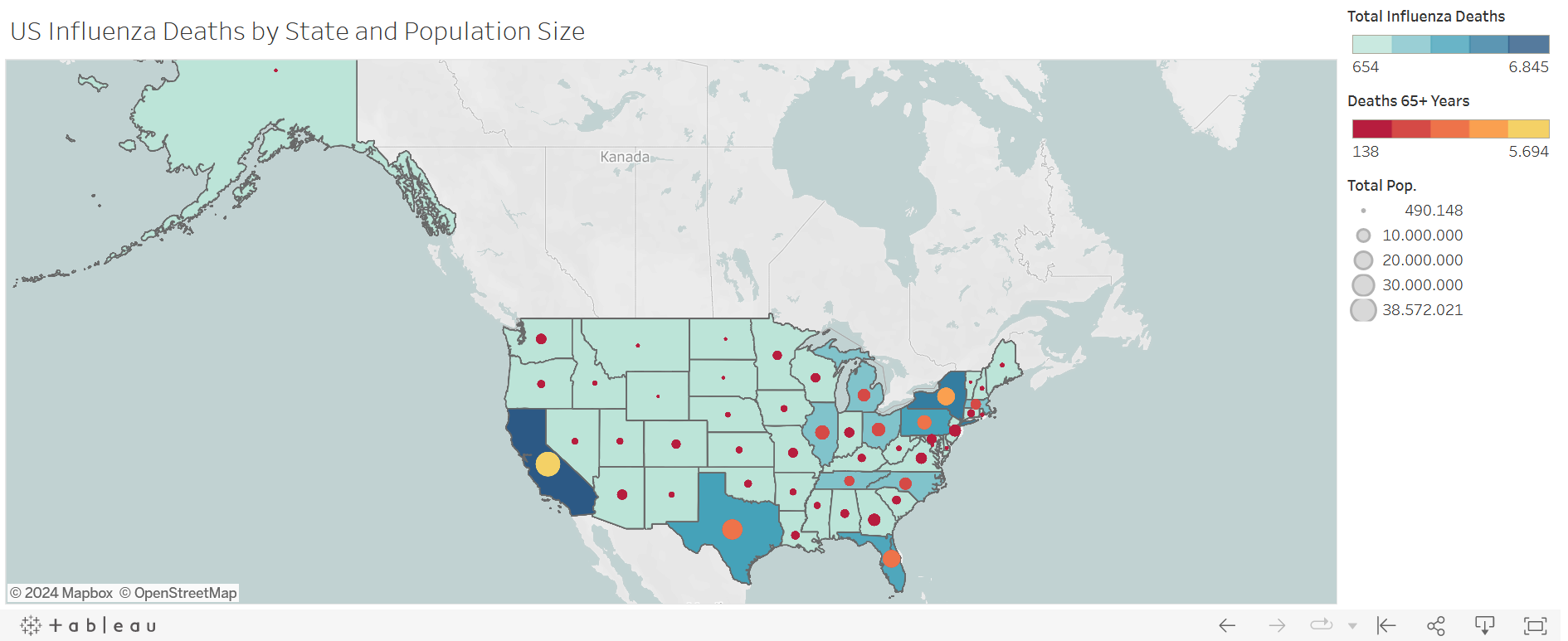
I created a variety of charts but I chose a chloropleth map with symbols in this case study (you can see the full storyboard on Tableau). The darker the blue, the greater the number of influenza deaths. The greater the circle in the state, the larger the total population of the state, and the lighter the circle, the greater the number of influenza deaths for age group 65+. We now had our 'hot zones'.
Step 6: Recommendations
Priority states (excerpt):
- California
- New York
- Texas
- Pennsylvania
- Florida
- Illinois
- Ohio
- North Carolina
- Michigan
It was also recommended that staff be deployed latest November, so that the swell of patients will not immediately overwhelm staff. Additionally, staff should be vaccinated as this limited abseenteism and gave greater confidence to staff.
Download Project FolderPlaceholder text by Mnguni Zulu. Photographs by Mnguni Zulu.